

Newrez Mortgage Application
The Newrez mortgage application is fully-digital tool that empowers users to buy, sell, and refinance homes in an all-in-one experience.
Agency • Targetbase
Client • Newrez
Role • UX Designer (Solo)
Timeline • 4 months
Platform • desktop, mobile, tablet
Tools • Figma
🎯 Objective
Conduct a comprehensive overhaul of the client's website and mobile app, going beyond a simple redesign of the look and feel. Revamp the user experience while simplifying the interface and driving innovation for enhanced usability.
❗️Business Problem
Newrez’s website and mobile apps lack intuitive design, consistent usability, and modern features leading to user frustration and reduced engagement
Challenges
Timeline: The biggest challenge in this project was the timeline. This crept up fast on our agency and didn’t slow down, even for developers. This expedited the UX research.
Stakeholders: The stakeholders were in almost constant disagreement, especially early on. More buy-in came with time.
Resources: Limited development and product team resources.
Testing: Testing was done internally and with stakeholders due to our lack of access to users and limited timeline.
Client innovation interests
Marketing Cloud personalized experiences
Looking to unlock personalization in new architecture
Event-based use cases
Would like to start introducing containerization within customer interfaces to consume marketing cloud content presented seamlessly.
Digital Self-Serve: Implementing Al Digital assistant chatbot which will unlock and extend the ability of engagement. List of prioritized prompts to
arrive at a very specific user journey and intent.Opportunistic Chat-Bot: Savings, offers, utilizing data points.
Triggers across all digital platforms.
Looking for IVR Al or automated servicing to accept payments, etc.
Localized Personalization, relatable, voices, accents localized.
🕵🏻♂️ Research
Competitive Analysis
This is done to discover who the market leaders and competitors are, what separates them, and what are their trends. Who are we up against? What are we up against?
User Persona
Creating a persona is helpful to reference when thinking about which type of user we’re likely to be dealing with. Considering things like:
Goals
Frustrations
Ideal experience
Buying behavior
Technology usage
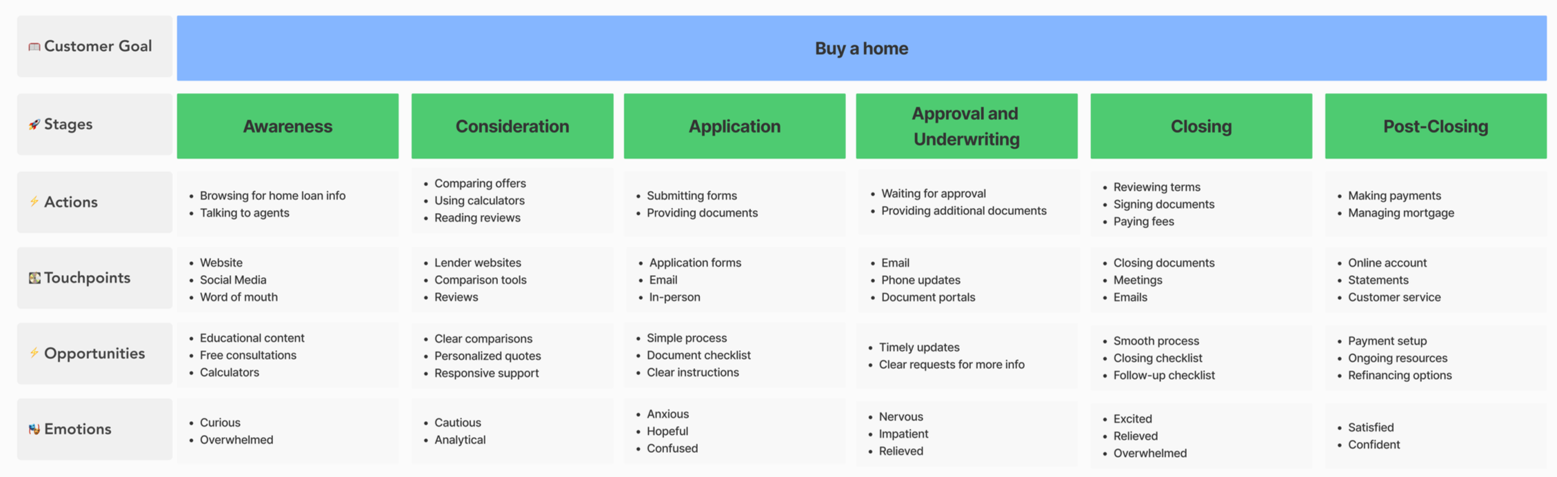
User Journey Map
Now that we understand some of the motivations and frustrations of our users, it’s time to try to empathize what the home-buying experience might feel like for them. Outlining the digital home-buying experience is important because that’s the primary goal of this product.
👨🏻🎨 Design
Design System
Let me just start off by saying this client did not have a design system or any components to work off of (besides brand colors and typography). Local project-level components were created for this project. Style choices were ran by the stakeholders for buy-in which was intended to kickoff a new look and feel for their products.
Mid fidelty
In most cases I’d start with low fidelity screens and sketches but because of the heavy use of AI during the ideation and sketching phase I’ll jump right into mid-fidelity. Early on after research my timeline for this project reduced very quickly on me.
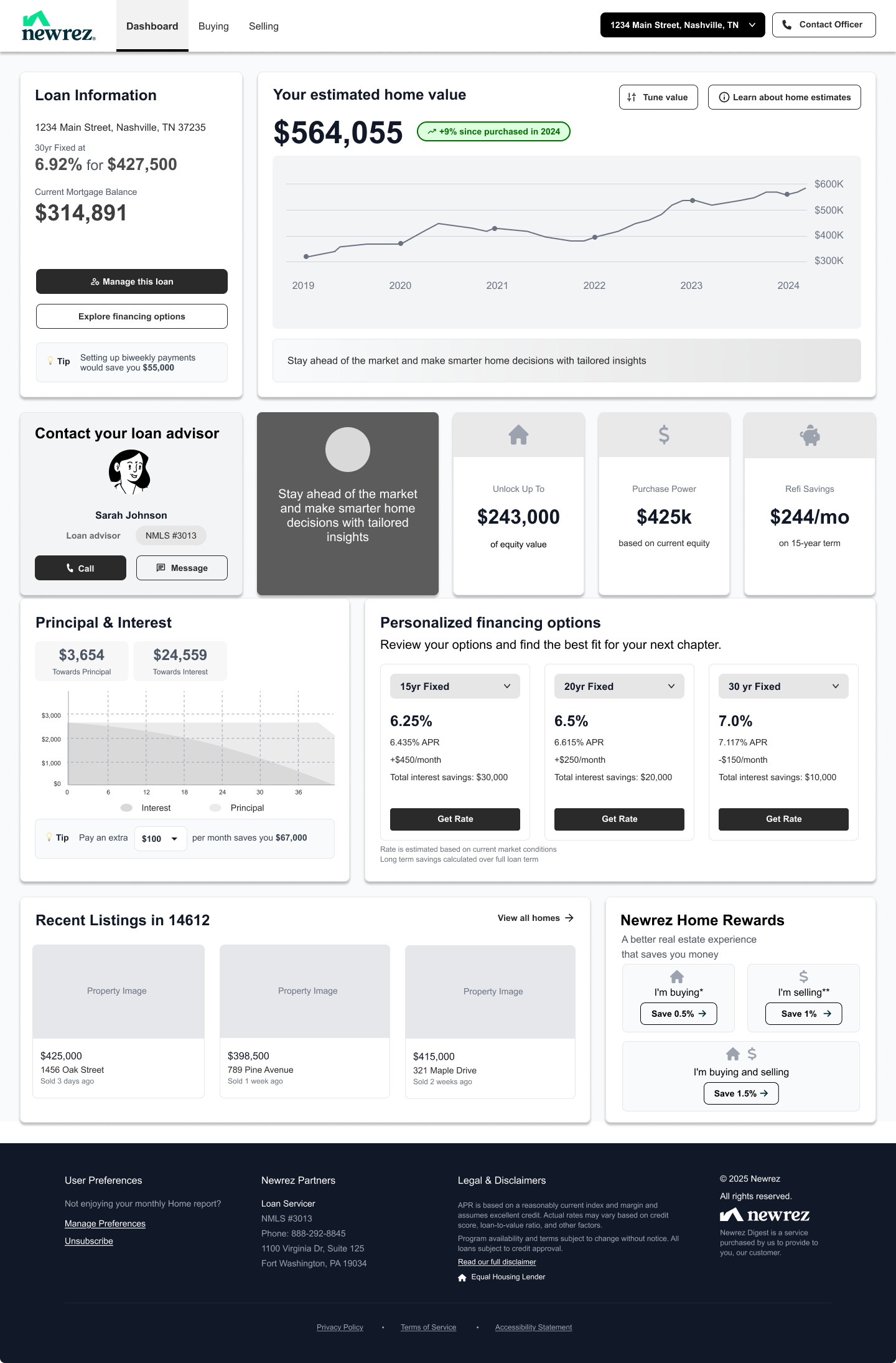
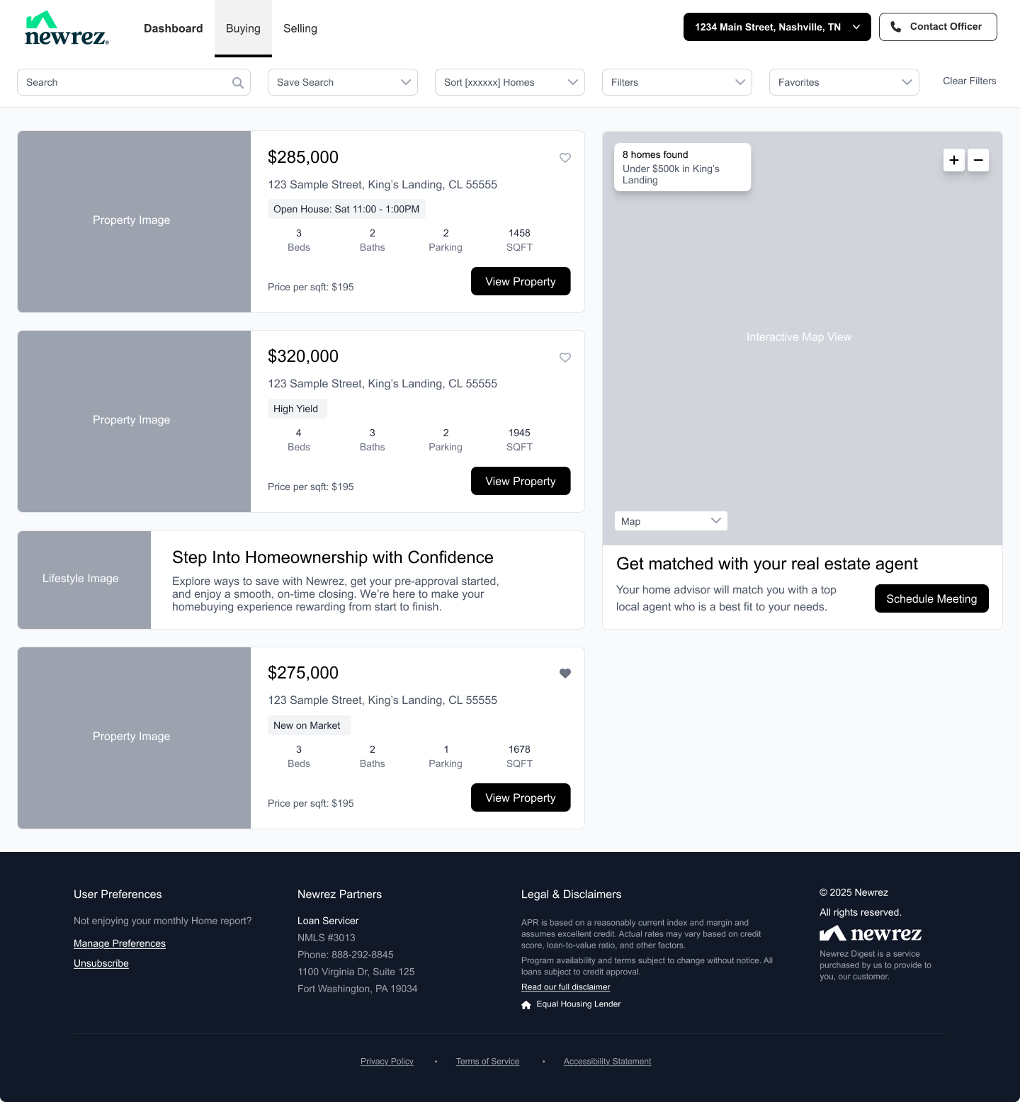
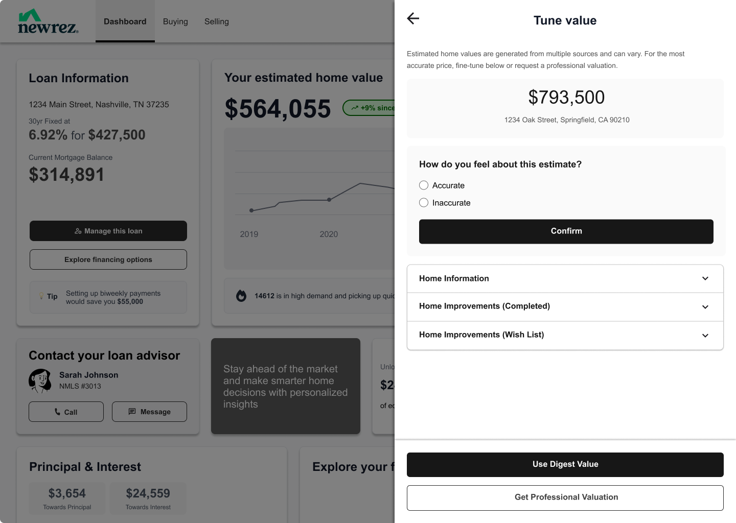
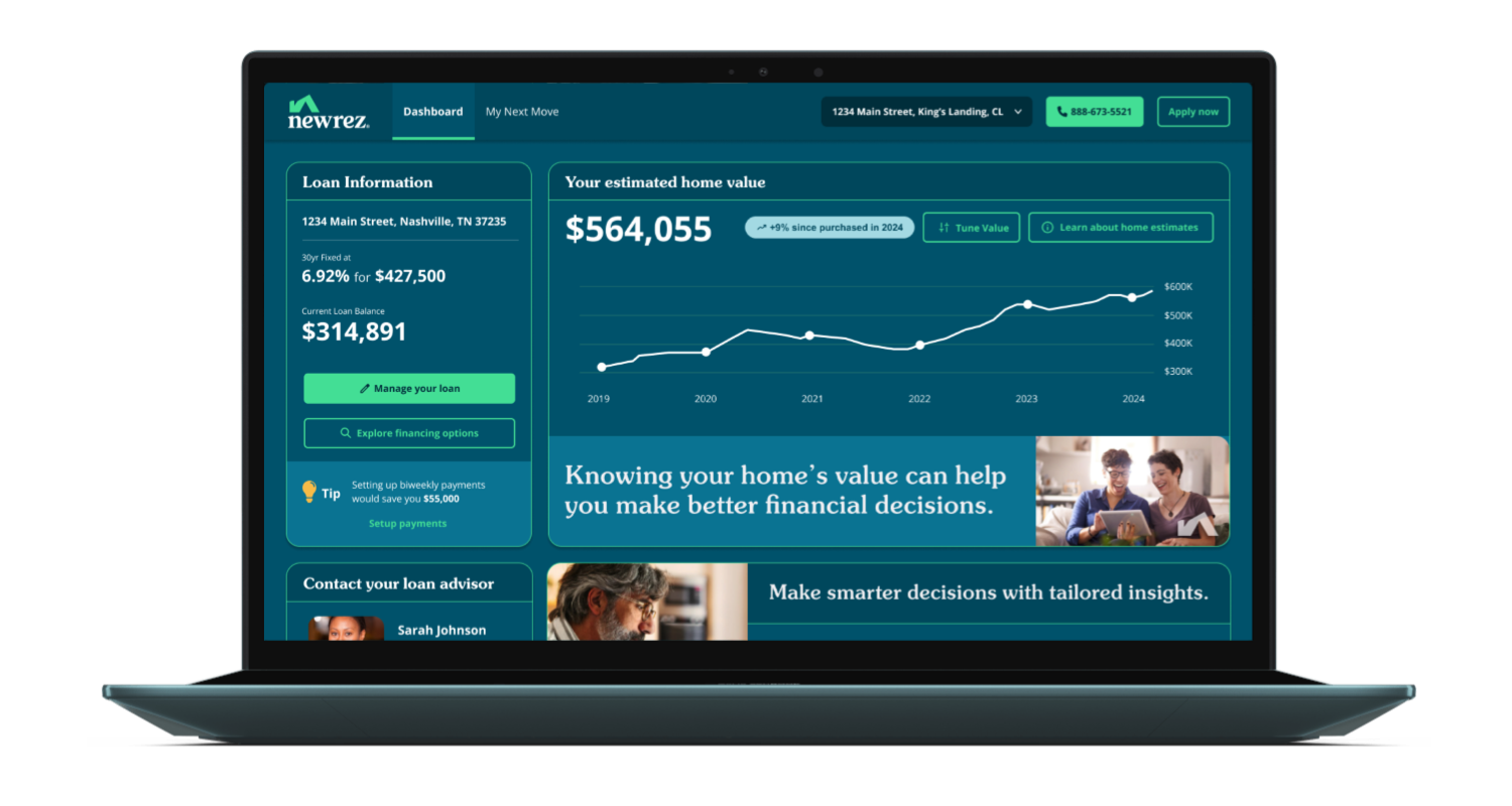
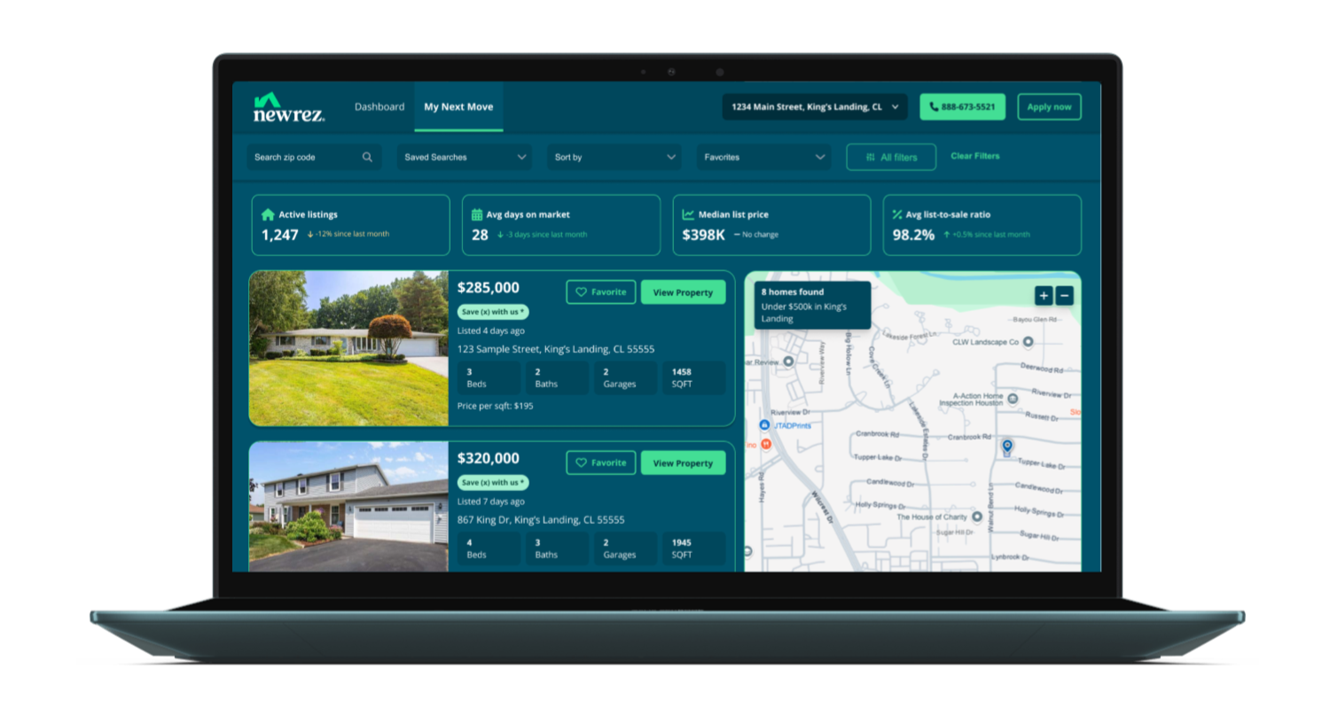
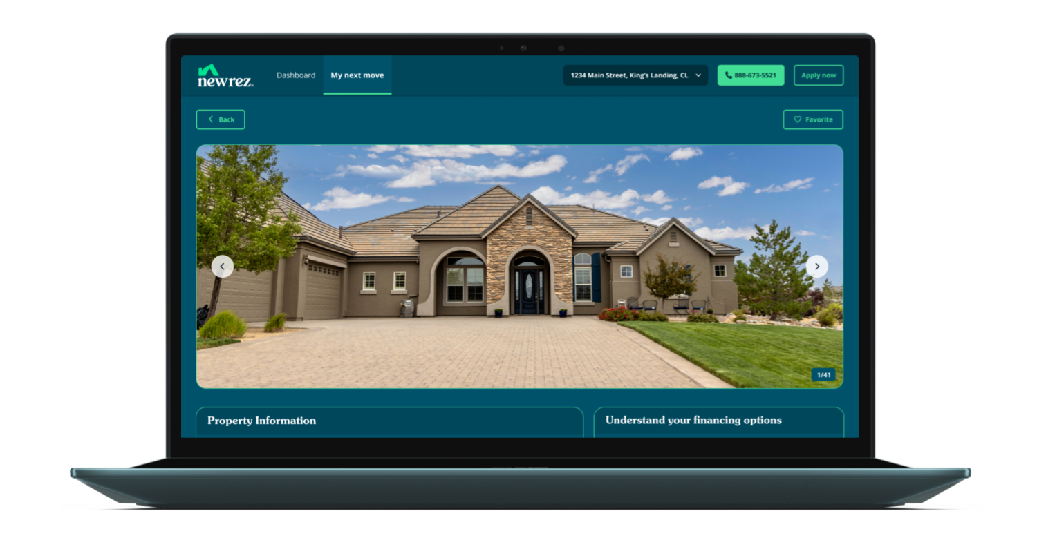
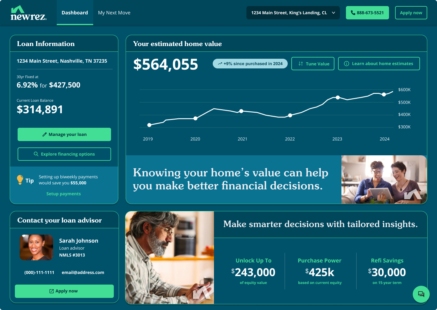
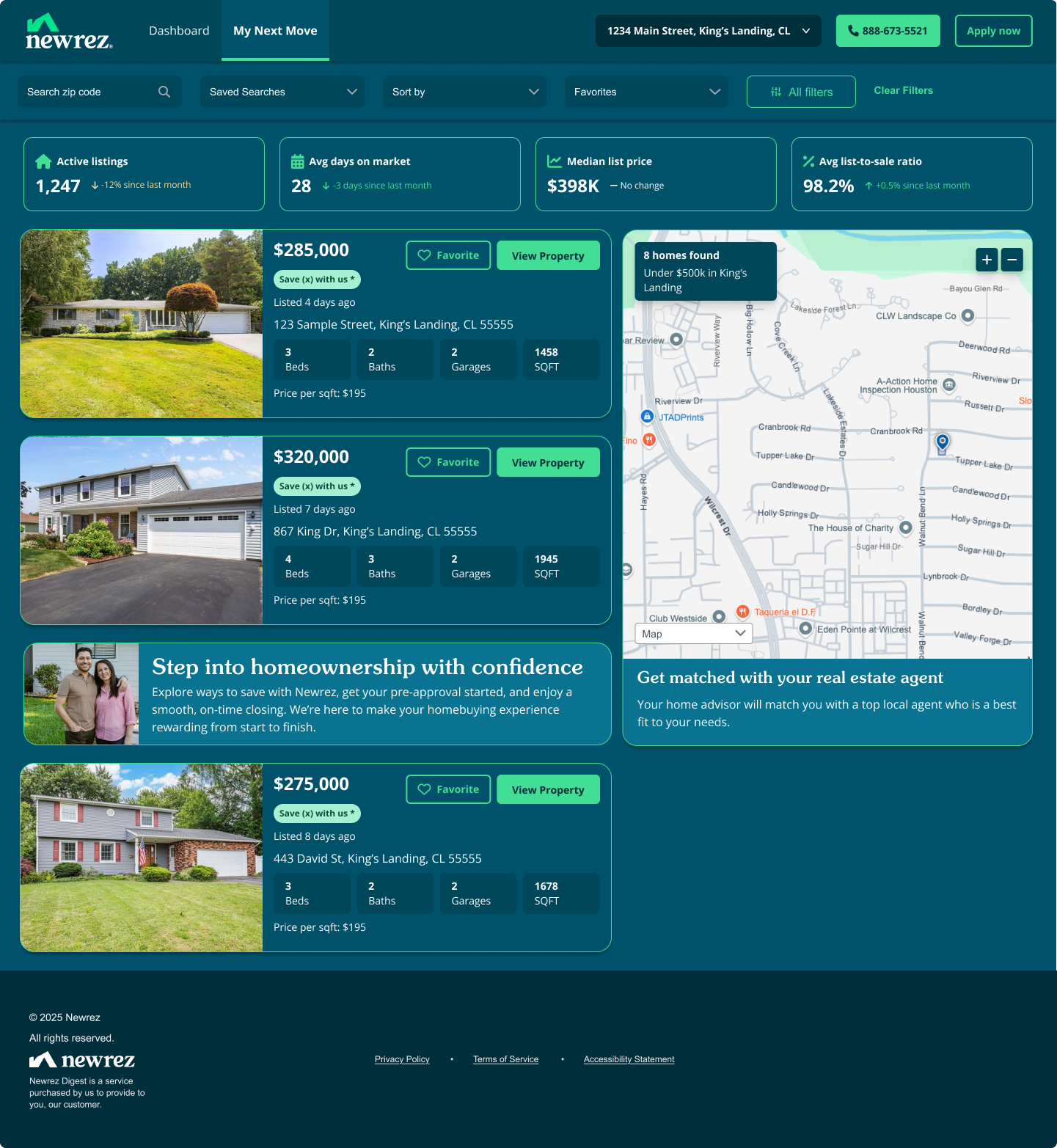
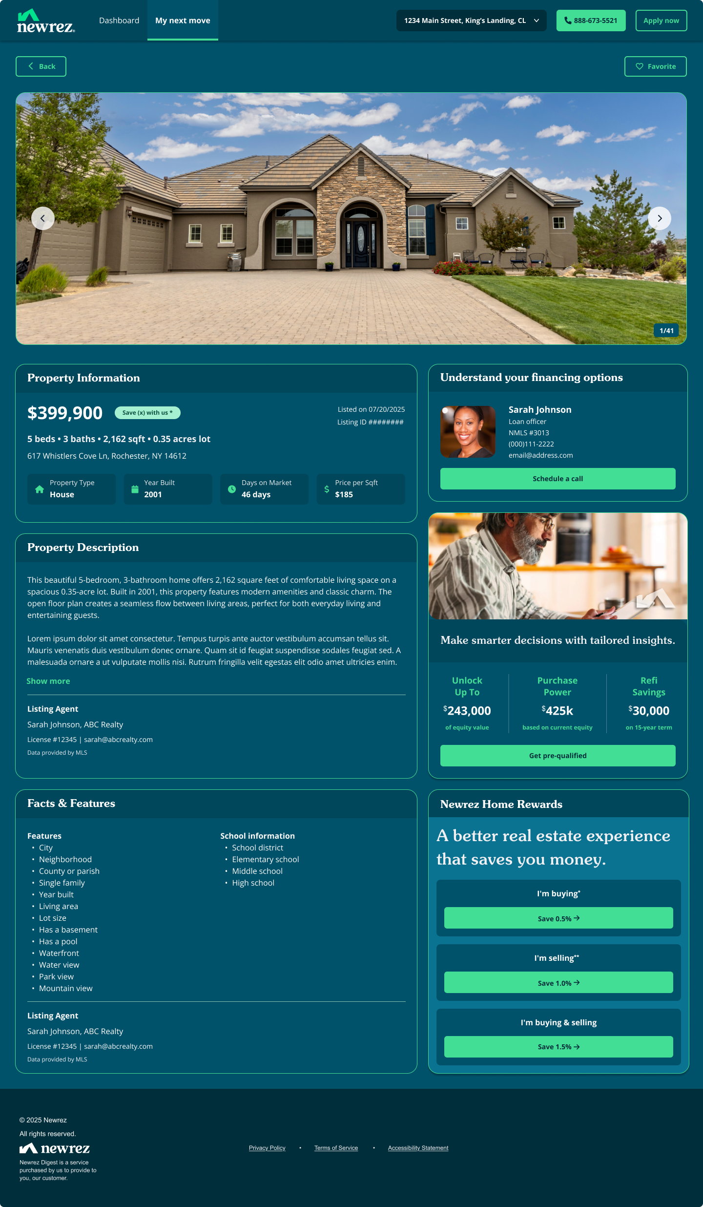
High Fidelity (Desktop)
High fidelity in desktop was designed and approved first because it was easier to present the designs holistically on a desktop view to stakeholders.
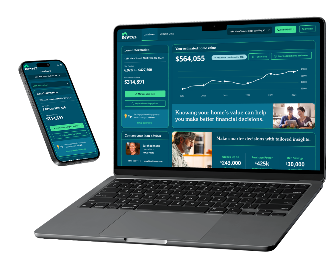
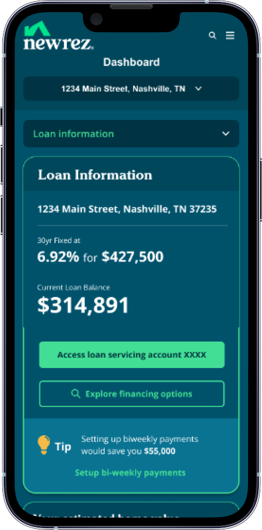
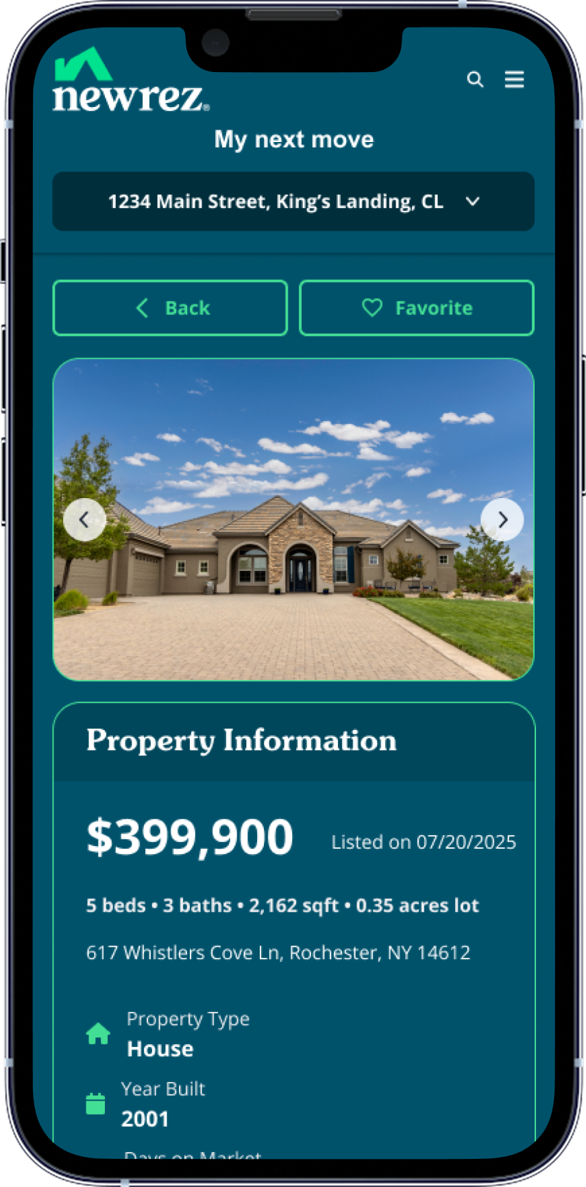
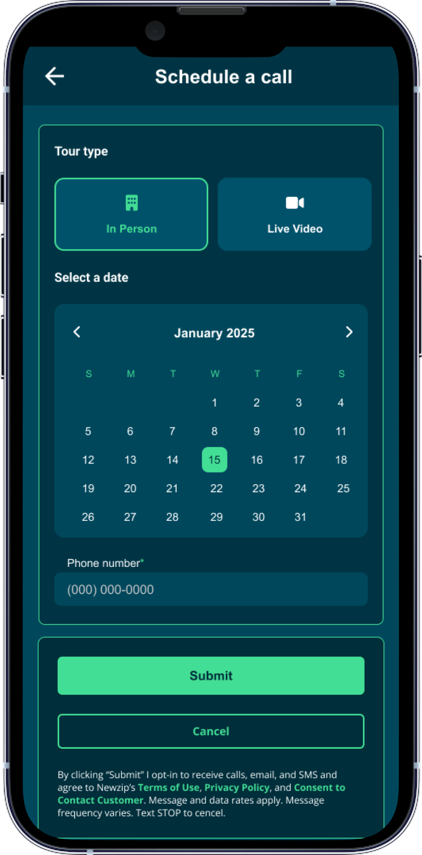
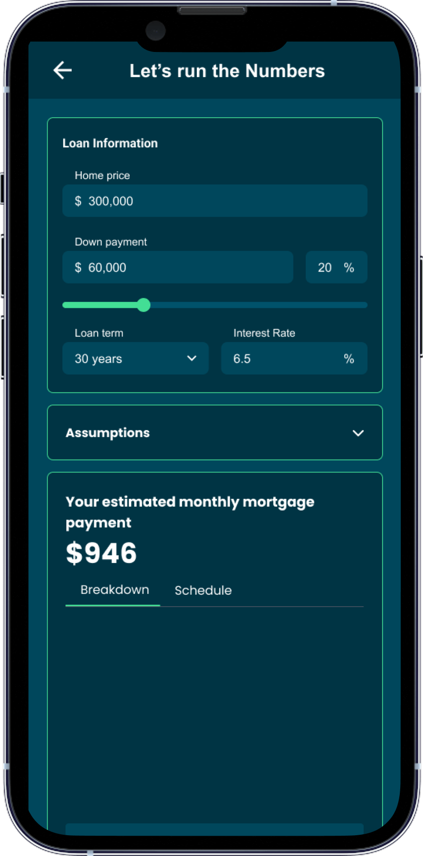
High Fidelity (Mobile)
Converting the desktop designs to mobile was quite easy thanks to auto-layout and the card-layout patterns that were established on desktop which allowed the designs to respond nicely.
✅ Conclusion & Next Steps
No project has perfect conditions. Although this project was shorter than expected I still delivered solid value to Newrez, completed the all requirements, and hit on the innovative client requests. As much of the time-crunch pressure that I felt, our development team felt it much more, so there’s that.
For next steps I would test this and iterate on incremental enhancements. Perhaps look into a more customizable dashboard.